Wednesday, 17 December 2014

Surrealism Research


SURREALISM IN ART AND FASHION

Salvador Dali

Salvador Dali is one of the noutorious and best known Surrealists of History. He was born in Spain and after a traumatic upbringing he moved to paris to attend an art school where he met and recieved guidence from Pablo Picasso. Salvador Dali's work has been decipted to show parts of his past along with random and distorted objects. While I personally like the imagary of his work I find that it's quite random and because of this I struggle to see the point in his work and for me I dont particularly like this. I like to know what I'm seeing and why I'm seeing it and with Dali's work it makes me feel lost.


 Man Ray

Man Ray was an American visual artist who contributed to both the Dada movement and the Surrealist movement.   His work captures his version of what is surreal and what is beautiful. I don't like Man Ray's work as i feel like theres no point to it. It doesnt really seem to have a theme and they are just abstract objects with little meaning.


Viktor and Rolf


“It’s natural to look for ways to turn a show into something more of an experience” – Viktor and Rolf

Viktor and Rolf started working together in 1993 when they were studying in University in The Netherlands. They created their brand a few years later and began making ready to wear clothes in 2000 and couture garments even before that. It’s clear that Viktor and Rolf incorporate surrealist themes into their designs, this was especially clear in the S/S 2010 catwalk show when their models featured chiffon dresses resembling Edamame cheese and the skirts looking like they had been cut apart and stuck back on in the most abstract of ways. Also when looking at their couture show in A/W 2011 they feature outerwear which could easily be called outlandish and surreal. Their runway shows always look like they’ve either travelled from crazy dream or a haunting nightmare.  I personally really like their couture creations as they are completely unwearable and at the same time totally memorable.


Hussein Chalayan


 Hussein Chalayan is a Turkish fashion designer.  In … he and his family moved to England where he studied Fashion in Central Saint Martins. “His graduate collection in 1993, titled "The Tangent Flows", contained clothes which he had buried in a back yard and exhumed just before the show where they were presented with an accompanying text that explained the process. The ritual of burial and resurrection was said to give the garments a dimension that referenced to life, death, and urban decay.”  After this his career continued in the same surrealist style it began in. Since then he has gone on to create some of the most interesting ideas, for example his balloon dress and the table dress. I like the originality of his designs to an extent, I find that they are very random but not necessarily in a particularly good way, I feel as though the initial thought of the design didn’t have a lot of thought in them. Obviously I understand that the fundamentals of making a dress out of balloons and/or tables is a very difficult process I still feel like the initial idea wasn’t very much of a development of ideas.


Iris Van Herpen

Iris van herpen is a Dutch fashion designer. After interning with Alexander Mcqueen she realeased her own award winning fashion line. Her award winning haute couture pieces are highly based on surrealist themes. Her work displays an obvious curiousity with the world and different parts of nature and natural forms. Van Herpen uses a combination of old and forgotten techniques and new technologies to create her pieces which over all work well to create eye opening and unforgetable pieces of art. I personally really like Van Herpens work as I find it to be a combination of simple garments along with crazy avant garde themes which compliment the other perfectly.
 

Wednesday, 3 December 2014

COMPOSITION 1

RULE OF THIRDS//


Rule of thirds focuses on keeping the subject within the horizon line, this gives a different feel to the photo. for example in the first picture the horizon line is in theupper third which shows there's more detail below the horizon line, while the second picture the horizon line is on the lowere third which gives more of an open feel, the third picture shows the rule of thirds being used with a grid.


RULES OF EVEN AND ODD//

Rule of Odds is if you have an odd number of objects in an image it will be more interesting and therefore better to look at. If there is an even number of objects, the brain would have an easy time sorting the objects into pairs and therefore bringing in symmetry and dullness.

"The human eye tends to wander to the center of a group. With even number of objects, eye will end up at the negative space in center.
The rule becomes important when trying to achieve a visually pleasing composition of several objects. A common form of usage is having three objects in frame, they always form either a line or a triangle, both are considered pleasurable shapes."


RULE OF TRIANGLES//

The rule of triangles is more of an unspoken rule, naturally when you take a photo you tend to capture everything in the shape of a triangle because triangles are in everything you see. The triangle tends to make a more solid shape in a photograph.


RULE OF SPACE//

The rule of space is generally created so that if the subject is looking into "space" the picture should show the space that is being looked into. This makes the story within the photograph very clear and helps complete the image.


Photoshoot outcome

OUTCOME / EVALUATION


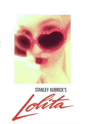
My photoshoot didnt go to plan at all despite changing the plan for the third time. I used myself for the model and did my own makup which was very simple and wore the iconic lolita glasses. My mum was taking the pictures and using a normal zoom as she hasnt got any camera skills. However due to natural lighting at this time of year being all wrong for an outdoor photo the results of the photo werent how i intended for them to be. After playing around on diferent editing softwares and photoshop for a while i reached the decision that my outcome wouldnt be how i wanted it to be. I am however happy with my research and the way i have presented all of my ideas.


 After cropping my picture I made some adjustments using the levels tool and playing with the brightness and colour presets, I added the original text from the 1997 movie poster.


If I were to improve my photoshoot I would go outside during the middle of the day and have the perfect lighting. I'd have also liked to not have had to change my ideas so much as it wasted so much time that i could have spent editing the picture (with help).

Fashion Photographer Research

IRVING PENN

"Irving Penn was an American photographer known for his fashion photography, portraits, and still lifes. Penn's career included work at Vogue magazine, and independent advertising work for clients"

- Exerpt, Wikipedia.


Irving Penn is one of my favourite photographers. He has worked with many infamous people such as Audrey Hepburn, Woody Allen and Jerry hall. His pictures are mostly in black and white and capture near perfect lighting and the energy of his subjects.The fashion shoots tha hes done for publications such as Vogue are also beautiful, they have graceful movement that reall show couture fashion in the best light. Irving Penn is known as the picasso of photography and looking at his pictures i understand why.

RANKIN

"Synonymous with compelling portraiture, Rankin’s lens captures, creates and unveils icons." - Rankin Biography

Rankin is a british fashion photographer. He is the co-creator of Dazed and Confused magazine with a friend from college Jefferson Hack. Rankin's work is very varied featuring many different styles. I think this is because he has many requests from many different publications and buisnesses. Most of his work is comission based or editorial and that work is generally his most sucessful.


MARIO TESTINO

"the world's most prolific magazine and fashion trade photographer"

- The Observer


Mario Testino is one of Vogue magazine's main fashion photographers. He has also shot many comission shoots for companies such as Gucci and D&G. His career's highpoint was when he was selected by Princess Diana for her Vanity fair shoot in 1997. I think his best work are his profiles as he captures the light and emotion beautifully. However i do really like his fashion and editorial pictures as they are very dynamic and eyecatching.


RUSSEL JAMES

Russel James is a commercial fashion and beauty photographer. He is most well known for being the official photographer for Victoria's Secret.


His photoshoots are mostly set in serene locations such as secluded beaches and remote locations. He has appeared in America's next top model and Australia's next top model many imes as a guest photographer and judge. I personally like his location shoots as they make for beautiful pictures.

Wednesday, 26 November 2014

photoshoot ideas

IDEA 1

My first idea is to do a pulp fiction themed photo shoot. I want to use the iconic picture of Uma Thurman's character and recreate it


I will use my friend Zoey as a model and give her a wig as she has blonde hair. I want to use Zoey as she has a similar Jawline and face shape. She will wear similar clothes and be in a similar setting as my friend lives in a flat with french doors so she can stand in front of them and i'll photoshop the fire into the background. The makeup is quite heavy as she plays a woman who is heavily involved with drugs and thugs and the makeup is what gives us that idea the first time the character is introduced and that's what i want to capture within the shoot.
 
I have chosen this image as Pulp fiction is an iconic film and this still of Uma Thurman is still one of the most fasmous pictures of her to date.
 

IDEA 2

Unfortunately my model broke her leg falling down the stairs so i have had to change my idea. I have decided to ude a picture of Edie Sedgwick and have another of my close friends Cara as the model. I wanted to use Cara as she looks a bit like Edie. I will draw on a beauty mark in the same place Edie did and photoshop her hair lighter. I will do her makeup as it is quite simple and have everything i need at home to do so.


I have chosen this picture because i find the style of the photo. It's very simple yet beautiful. Another reason i have chosen to use Cara is because she has very similar eyes to Edie's and the eyes are a very important part of the photo. They look very inncocent and youthful which is over all cara's whole personality so hopefully that will reflect in the picture.
 

IDEA 3 (Please be the final)

As my friend Cara is a radiographer she got called into work the day she was meant to do the shoot so again, had to change my idea. For my (hopefully) final idea i have decided to use the iconic picture from the movie adaptation of my favourite book Lolita. The book was written by Vladamir Nabokov and features the controversial story line of a man who falls in love with a pre pubescent little girl. I like the book as it is beautifully written and the film adaptation captured the characterization well.
 
 
I plan to model for this picture as I refuse to have any more issues with this project. I also dont like the idea of having a child portray the sexual icon that Lolita is writen to be in the book, which was my initial idea with this concept. I own a pair of red heart shaped sunglasses and i like lollipops so i'm sure i can find a few in a shop or in my house. James and i both want the typography in the picture so i will write it by hand (maybe in lipstic as i like the idea of that) and scan it through and add it to the picture in photoshop. The makeup in this picture is pretty non existent as the character of Lolita is meant to be between 10 and 14 (not specified). However she is wearing bright red lipstick that matches both the glasses and the writing so i will bear that in mind when chosing the shade of the lipstick.
 
FOR THE SHOOT I PLAN TO USE EITHER MY IPHONE CAMERA OR MY CANNON D500 TO SHOOT THE PICTURES DEPENDING ON WHICH I AM MORE COMFORTABLE USING AND WHICH GIVES THE BEST RESULTS.


Wednesday, 22 October 2014

Unit 1 - Visual Recording in Art and Design


Levels shortcut: Ctrl + L

With the levels tool you can adjust the brightness, contrast, shadows and the midtones.


Wednesday, 24 September 2014

Learning how to use the multiply tool!! :)

  • Select the magic wand tool and click on the background of your subject

  • Right click and chose "select inverse"

  • Click on the drop down box beneath "Layers" and select "multiply"